
A new architecture for Squarespace Block Editors


Old → New Image Block
Block Editors are the foundation of building a Squarespace site – allowing users to add images, video, text, code, social media content, and so much more.
These blocks are meant to provide a simple way to build a website page, piecing each block together to build a complete site. However, through research we found that users struggled to find basic tweaks in the blocks.
We hypothesized by building a consistent editing paradigm that users can easily learn and recognize how to use these blocks.
Problem
Inconsistent Structure and Design
Reviewing all blocks and conducting user interviews, we found an inconsistent editing experience creating confusion for users trying to perform simple tweaks, such as editing button text.
Layout options inconsistency across three blocks
Design & Tech Debt
The Block Editors were first created in 2014 using a now outdated code base and design system. They also were built separately so they lack consistent UI and structure.
Updating 39 blocks to the current Squarespace Rosetta design system and migrating to current React components was a massive undertaking for Content Strategy, Design, and Engineering.

Various block editors still using the old design system
Process
Information Architecture
Working closely with Content Strategy and UX Research, we catalogued every setting in the block editors and developed a new structure.

Block Editor Content Tab
The text, media, and elements that a user adds into a block to communicate to their audience.


Block Editor Design Tab
A broad category of settings that allow users to manipulate the arrangement of elements, blocks, or sections in a container; the volume and size of their presentation; and their overall look and feel.

Tree Test
We conducted a Tree Test, which is having users find the locations in the tree where specific tasks can be completed.
APPROACH
2 taxonomy versions: old block vs. new block
4 blocks per version: image, button, summary, newsletter
45 participants per version (90 total)
Success metrics:
Success: did the user select the correct answer? Y/N
Directness: did they get to the correct answer directly or indirectly?
RESULTS
In the Tree Test, we saw improved speed of task completion between old and new, indicating a significant improvement with the new architecture.
“Everything was where I thought it was. In the end it was pretty easy find everything. You had everything in the right category.”
— Tree Test Participant

Task Performance results (Left: Old block performance, Right: New block performance)
Solution
Consistent Hierarchy
The new block editors follow the same hierarchy the same settings are in similar locations.

Updated Block Editors

Image Block
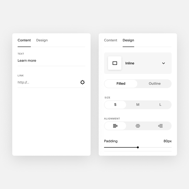
Button Block

Video Block

Map Block
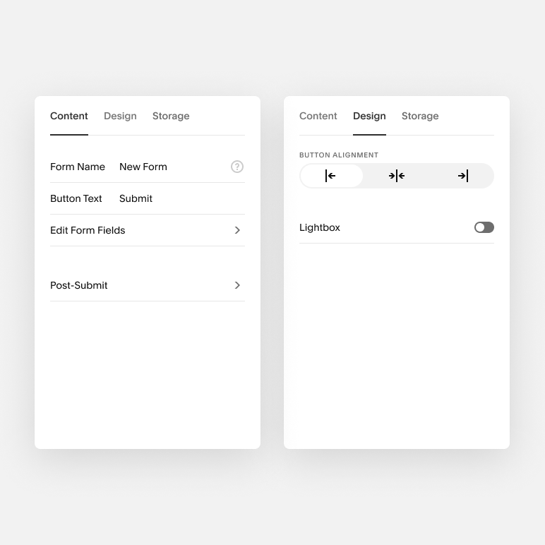
Form Block

Summary Block
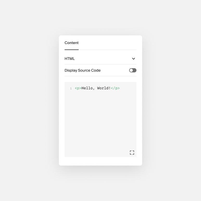
Code Block

Quote Block

Social Block
Mobile Ready
Updating the blocks to the current design system also means each component of the block editor automatically has a mobile friendly version.

What I learned
As I redesigned block editors, I realized the design should be more fluid and accommodate each block’s specific needs. For example, I made the Code Block much larger after release because users need a lot more width when editing code.
Continuous validation with user testing was really important to validate that we were on the right path.
Working closely with our design system team was vital to work through any issues with our components.
Redesigning a current feature can make UX worse if you don’t account for most use cases.